Reflecting on The Fundamentals of Typography (Chapter 1)

What factors affect the text you’re reading on this blog right now? It turns out, quite a lot. The first chapter of The Fundamentals of Typography aims to provide an overview of the history and development of type.

Ironically, where this chapter fell short, for me, was in its design. It is quite possible that the design would be better suited for print than for reading on a screen, but on screen, the design was scattered. Attempting to provide an overview on a subject with such a rich history is daunting and requires careful thought in delivering it so that readers can comprehend it. Unfortunately, for this chapter, the typography and overall design detracted from its delivery. In many cases it was difficult to determine whether you were reading a heading or an example. That being said, it certainly drives home the point of just how important typography is in our every day lives.

Of notable interest in the reading was the transformations of many of our letters we use today and how their writing styles have been dictated by their mediums. The letter ‘A’ we’re so familiar with today, was originally flipped upside down, and representative of an ox. Chinese is typically written down the page rather than horizontally to account for the fact that it was commonly painted with a brush and ink or paint that needed to dry.

Letterform Project (v.2)

It’s easy to doubt your ability in a field while you’re a grad student. You feel like your critiques may not be adequate or up to par with a “real” graphic designer. Thankfully, a missed class was actually responsible for realigning just how much we’ve learned.

Since I missed class last Monday, I turned to friends and family for feedback on my version 1 Letterforms. It turns out, getting feedback from someone isn’t as easy as it is in a class full of designers. My first response was only that the photos seemed to be representative of the concepts in the same order they were listed. The second while much more valuable, including “why” they believed each example to represent a specific concept, also included a disclaimer that if their answers were “wrong”, they’d change them.

My designs for random and static were unanimous. Even without descriptions, the ideas came through, as was the case of the x’s representing a placeholder came through for the static concept.

The two that raised questions however, were Unity and Grouping. In fact, the responses I got tended to switch the two. What I had intended to symbolize unity actually portrayed grouping to most people while what I had intended to symbolize grouping seemed like unity. As a result, I felt it was best to use my original design for grouping as unity and redesign the unity concept as grouping.

You can see my version 2 designs below:


Reflecting on Allen Haley’s “Fonts vs. typefaces, explained by a designer”

The terms fonts and typefaces seem to be used interchangeably these days. Admittedly, that’s because their differences have been masked by the advent of desktop publishing. Unfortunately, its hard to really deduce this from Haley’s article, “Fonts vs. typefaces, explained by a designer”. Despite the title, I found the article lacking any real explanation of what make a font versus a typeface.

Instead, I turned to two other articles, Jen Kim’s “Typeface vs Font: What’s the Difference” and John Brownlee’s “What’s The Difference Between A Font And A Typeface?”. The two articles artfully depicted the differences in addition to explaining the meticulous process of crafting a typeface.

In Jen Kim’s article, the differences were explained quite creatively through a designer’s illustration of a typeface twins where each twin may look a like but weigh slightly different. Each twin is a font, and together they form a font family or typeface. It ended up being quite a good analogy for explaining the concepts.

John Brownlee’s article was similar to Allen Haley’s but included pictures that really helped. For someone who’s never actually seen any sort of analog printing equipment, it’s hard to grasp the idea of a typeface or why it would have ever been relevant, so seeing the characters displayed in their rows was a good inclusion.

Letterform Project

In school, you’re constantly trying to meet a word count for every paper you write. When you’re concerned about getting the last 1000 words finished, it’s easy to lose site of just how powerful individual letters can be.

For our Letterform project, we were asked to depict 4 concepts using only three letters. I was worried I’d have trouble coming up with designs. I didn’t think it’d be possible to depict an entire concept like unity with only three letters.

The key for my designs was to focus less on the letters themselves, but the shapes and feelings they represented. A sans serif X is very boring, serious, and monotonous and reminded me of static. The letter O could be transformed into a ring to indicate unity, and the letter C could be used as a curve.

The exercise itself was a lesson in thinking outside of the box. When it comes to design, you can’t think too literally or you will miss out on creative opportunities.

Photo Essay #1

For our first photo essay, I figured what better subject to pick than craft beer. These days what’s on the outside of the bottle is just as important as what is inside. I headed to Corridor in Laurel, where I was presented with no shortage of interesting uses of typography. Some were better than others at conveying their message. Some didn’t seem to know what their message was in the first place.

How Many Fonts is Too Many Fonts

Lots of fonts doesn’t have to be bad. DuClaw’s Sweet Baby Jesus branding pulls it off. The beer to the right, however, fails miserable. In fact, I struggled to figure out what was going on. I’m still not sure what the name of the beer is.

Using Typography to Illustrate Concepts

Typography All Around Us

Walking around Corridor was fun, but typography is everywhere, and I found plenty of cases of cool typography just walking around my neighborhood. It turns out Relay has a lot of very cool signs both historical and for advertising.


Tracing Fonts

5d0e9bf3-4697-45b8-b418-b6337be5e34b

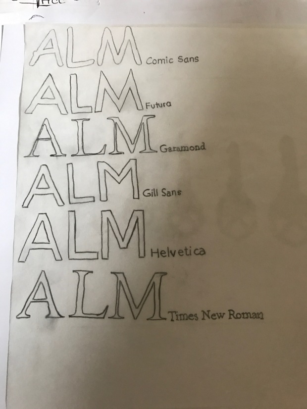
This week, one of our assignments was to trace fonts. I started with Comic Sans and found myself questioning whether it might be a cruel joke tracing such a mocked font, but as I continued, I started to notice the nuances of each font. I found the serif fonts easier to line up, but much harder to trace. Tracing the sans serif fonts wasn’t that much easier. Despite their simplicity, there are small details which make or break the font. For instance, Helvetica’s font has flat ends for all it’s letters, whereas Futura combines both. We see most of these fonts on a regular basis, but sitting down to trace them was a worthwhile exercise in paying attention to the details that go into making them.